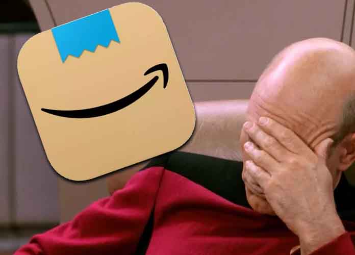
Tech giant Amazon, who canceled conservative social network platform Parler has itself faced the wrath of cancel culture and swiftly responded.
A rebrand of the Amazon shipping logo this week was met with sharp criticism after customers felt the new logo looks a little bit too much like an emoji that can also be used to represent Nazi dictator Adolf Hitler.
Shortly after it was pointed out, Amazon issued a quick fix.
“Amazon is always exploring new ways to delight our customers. We designed the new icon to spark anticipation, excitement, and joy when customers start their shopping journey on their phone, just as they do when they see our boxes on their door step,” the company said in a statement, completely sidestepping the whole ‘Hitler’ thing.